
Drawing icons using Core Graphics
Sometimes you need to add an icon to your iOS app, The designer sends you that plain, simple icon. It can be a bitmap-based icon, like a PNG. Problem with those is they get blurry if zoomed in too much. So we can use a vector-based icon, like a Font Icon or a PDF. These are vector based, contains the instructions to draw the icon, not the icon itself. This way you can stretch the icon as much as you want, and you’ll never see “big pixels” in your app.
But what happens when you have a screen capture of your icon, but can’t get any of these options? Well, this means it’s time to dust-off your Core Graphics Skills and draw the icon by yourself. Won’t even mention the horrible alternative of taking a screenshot and cutting the icon. Don’t do it. I’ve done it and it’s, indeed, horrible.
Instead of telling you what Core Graphics is and how it works, we’ll write code to solve a problem, so you can experiment and learn by doing. This is my preferred way of learning a new framework / library / language: try things, read a bit, try more stuff, read more seriously, watch videos, GOTO 1.
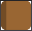
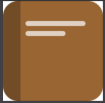
The Notebook Icon
The icon we’ll try to recreate is this one:

Represents a notebook with a background color that can change, a darker same color spine and a couple lines to represent the Notebook title.
Create a new Playground
We’ll do all our coding inside a Playground. So we can get instant feedback. In the end, it will look like this:

But for now let’s create a Playground called Icons. It will just have one Playground page. Remove everything inside that page and just add:
We’ll use the first import to draw Views and use Core Graphics (it’s included by UIKit). PlaygroundSupport will help us show nice previews of our work inside the Playground.
Planning our work
Looking at that notebook icon we can see it’s composed of 4 rectangles:
- a big rectangle that forms the Notebook itself
- a spine rectangle
- and a couple rectangles that seems like text written as title and subtitle
So we’ll do exactly that, starting with a view that will be the main notebook icon.
The Notebook Icon View
We’ll start with this:
Putting this in the Playground, we get a white square painted in the preview. What’s happening here?
- we define our NotebookIconView class. Will be a subclass of UIView, so can be easily added to any other UIView in our program.
- then, we create an instance of this class, passing in a CGRect. This is just a rectangle with the dimensions of the
NotebookViewwe want to create.
- finally, we tell the Playground to show us the NotebookIconView:
The view appears White because that’s the default background color of the Playground Support View, and icon2 own backgroundColor is nil, meaning transparent color.
A builder for the icon
We want to pass more information while we create our icon. We need to pass in a CGRect to set the size and a colour. And we'll have to adjust the corner radius (to make this rectangle corner's rounded). We'll use a static factory method:
Now we can create another icon and show it in the preview:
Progress! We now have a view with desired background color and round corners!

Notebook Spine
Up until now we’ve created a view, changed its color and round corners. Now it’s time to draw inside that view. To do that we’ll overwrite UIView:draw(_ rect: CGRect).
Also, we’ll add some constants to get correct proportions of all rectangles. If we set the spine’s width to, say 40 points, it will look great with a Notebook icon 200x200 points in size, but too small for a 2000x2000 icon. So it’s better to use a proportional factor.
Let’s add this code inside NotebookIconView, just after our build method:
Thanks to the clipToBounds property, although we're drawing a regular rectangle, it get's clipped and we just see the external rounded corners of our main view, but we can see it's a regular rectangle after all just by looking at then internal corners of that rectangle. If you want to really see that rectangle, change this line to:
Finishing touches
Now we need to add the two “Title lines”. Again, two more rectangles. Let’s add this to our draw method:
Also, we’re using this small function to draw rounded rectangles easily:
Here we use a path, which is a closed sequence of points. Remembers those drawings you can do just joining points with lines? A path is just that. We define a path using a rectangle, set a cornerRadius so the borders are rounded and fill the area inside that path with a color.
This is our final result. You can make taller, wider, etc. Experiment with it!
Improvements
We are using a fixed corner radius (15), that can look good if you’re using a small icon, but not so great with a bigger one. If you like this article and say Hello in twitter, we’ll add that and also create a new icon for different file types, with text, color, etc. Something like:
Just copy this code inside a playground and start experimenting. It’s the best way to learn something!

